Summer of Solar Love: Process
An illustration that shines a light on renewable energy solutions
There's a heatwave in the UK and even in Edinburgh it's too warm to do very much - so today I'll spare you long bits of philosophical writing.
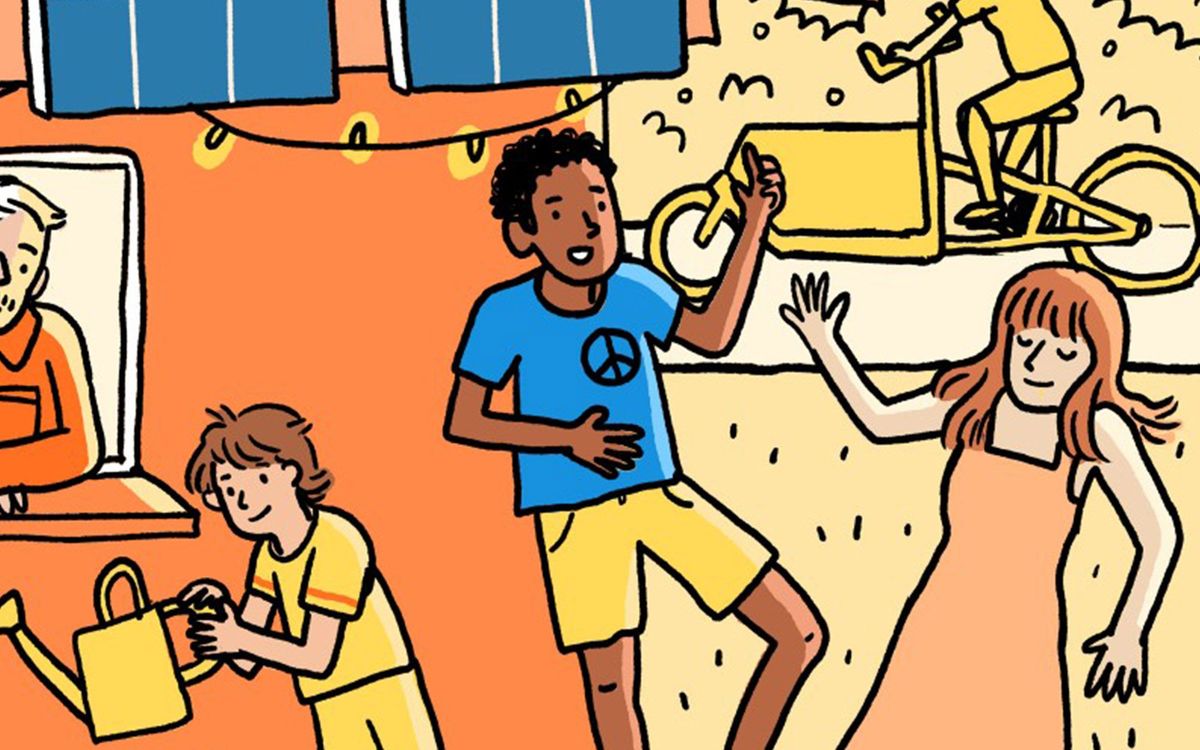
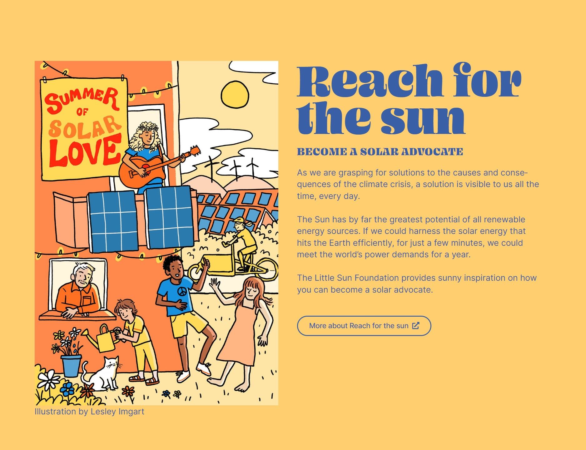
Sharing this illustration, which was commissioned for a climate activism project, feels appropriate now as Europe is in the midst of a heatwave. It's quite a hopeful reminder that people are constantly trying to find solutions to climate change. Often, I feel awkward trying to say anything clever about these things, so luckily I can keep it image-heavy by sharing the progress of making the illustration from start to finish. And although the reason behind the commission might be a serious one, it's actually a very joyful image!
I was asked to create this illustration by Parents for Future climate activists who were working on a Patagonia-funded community outreach campaign to promote the use of renewable energies. Or, to put it more simply, they wanted an illustration that made solar panels look fun. The illustration needed to be summer-themed and feature people having a great time, and it was intended to be used online and on postcards.
My fingers are sweating as I am typing this on my keyboard, so let's get started!
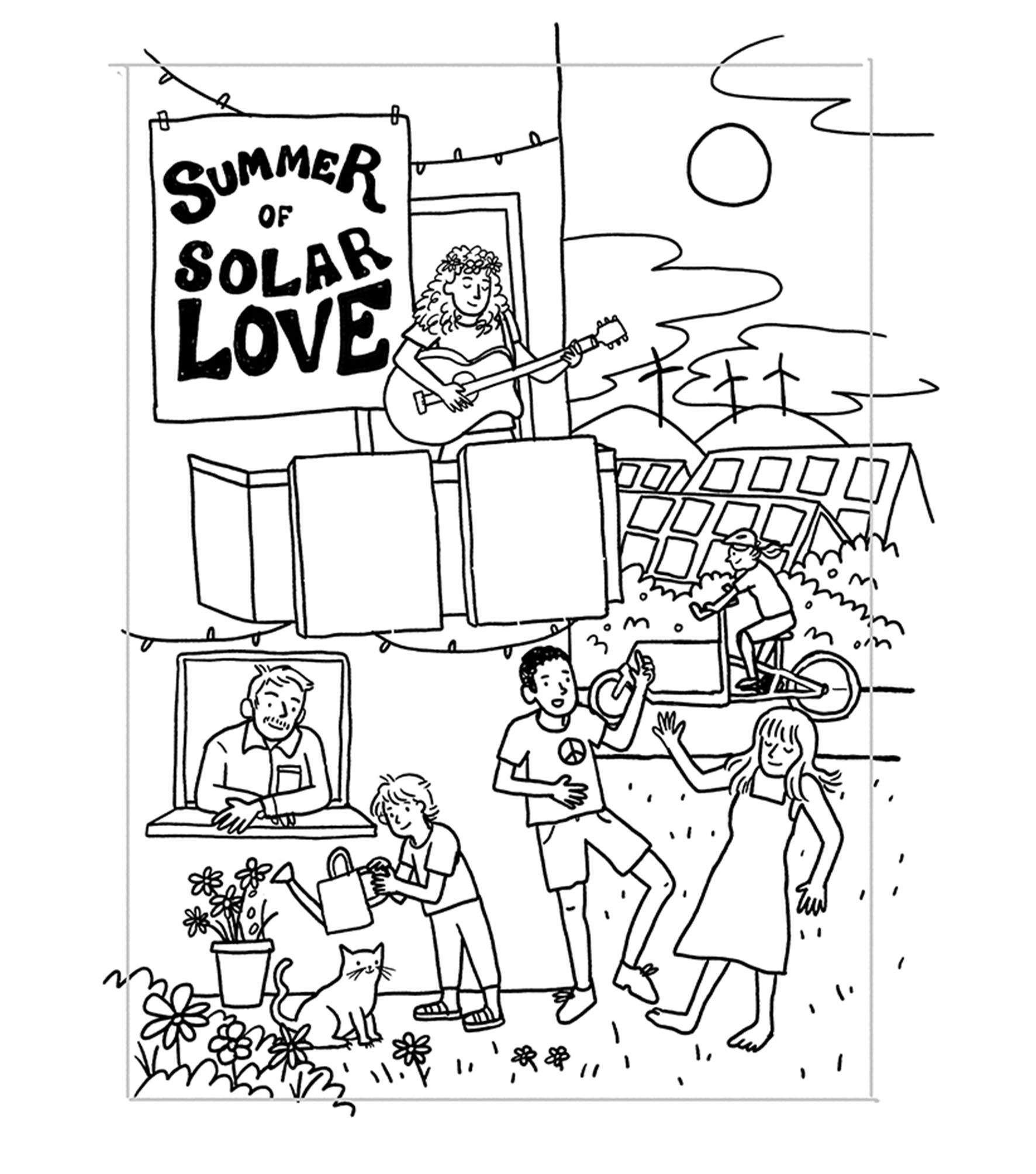
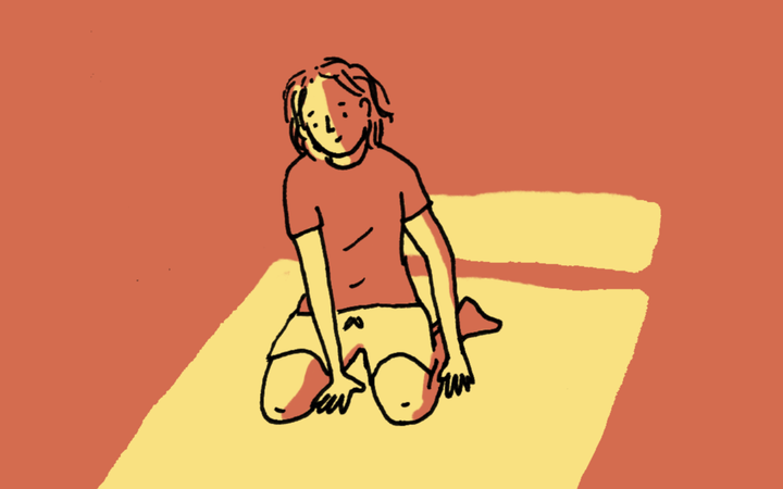
I started by creating two concept sketches, one a more traditional scene, one more abstract, focussed on the text.
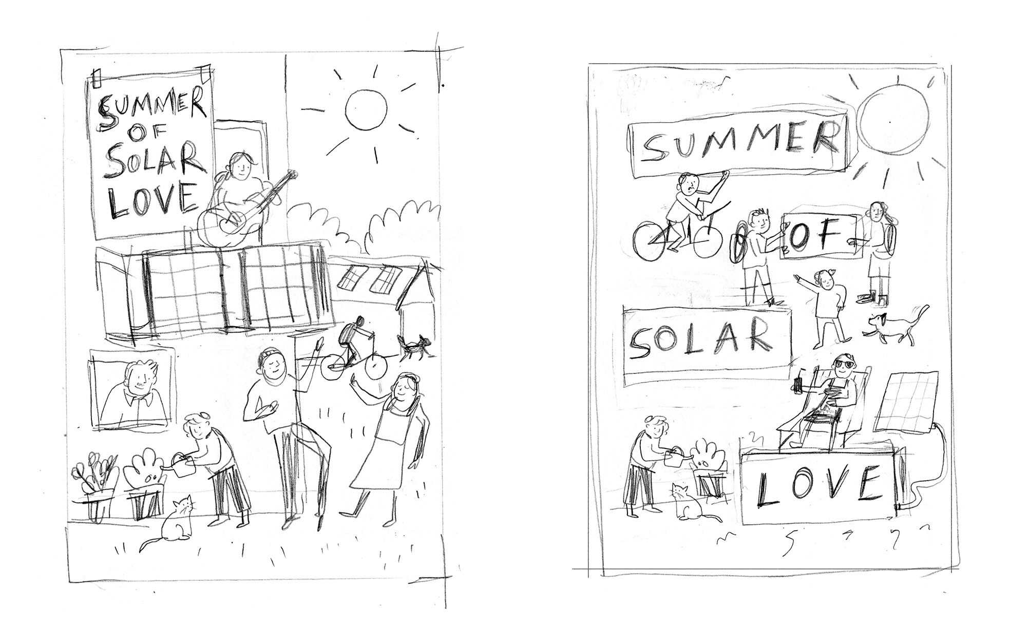
It was decided to go with the first option, which showed people having a great time outside. I immediately knew that it made sense to contrast the sunlight with other colours before I had even started the finished drawing, so I did an early mockup with a bit of colour. I also was asked to include more solar panels in the background.
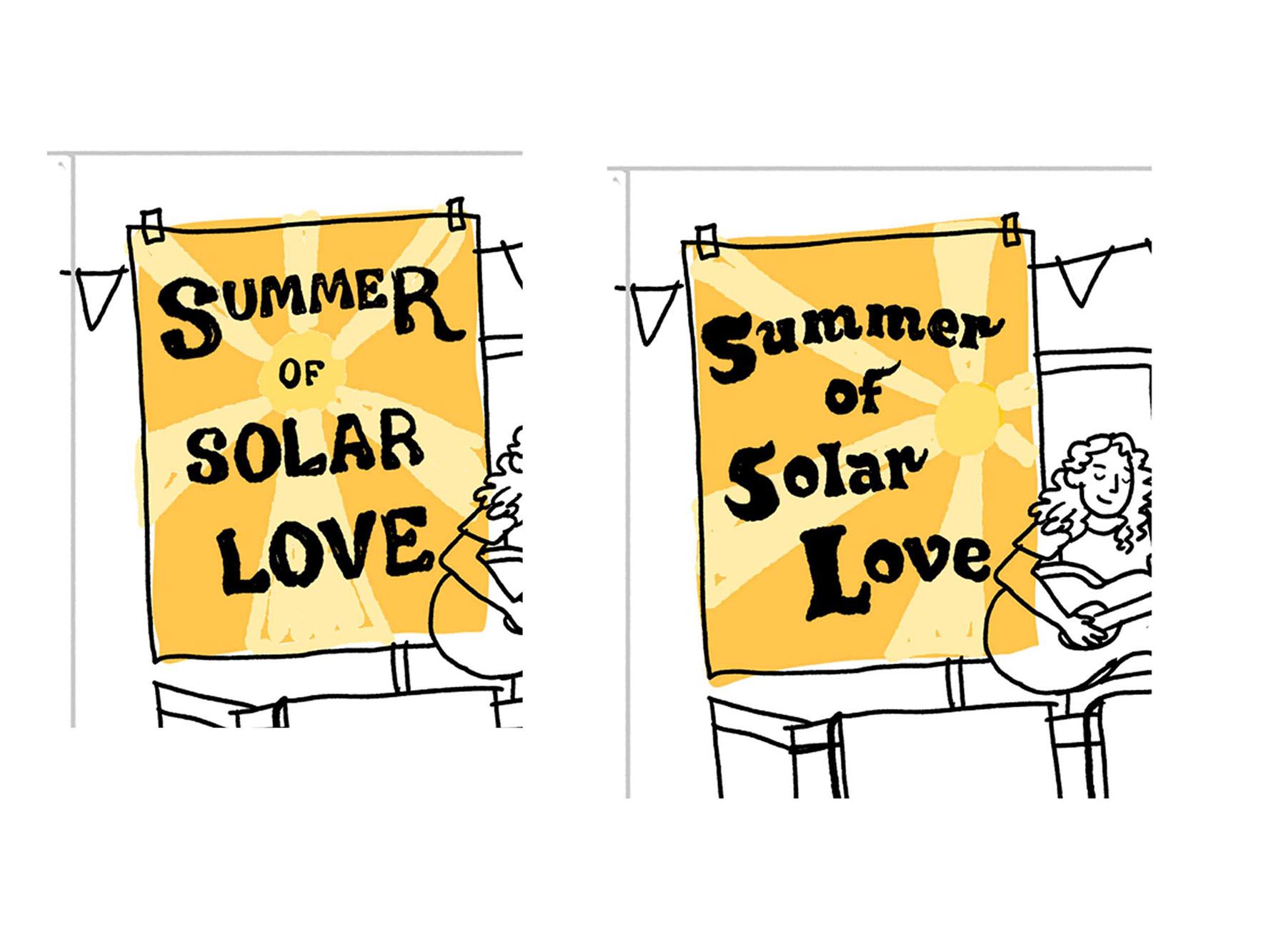
I also needed to develop the "Summer of Solar Love" writing - a hippie, slightly psychedelic look seemed appropriate here. A couple of attempts are below.
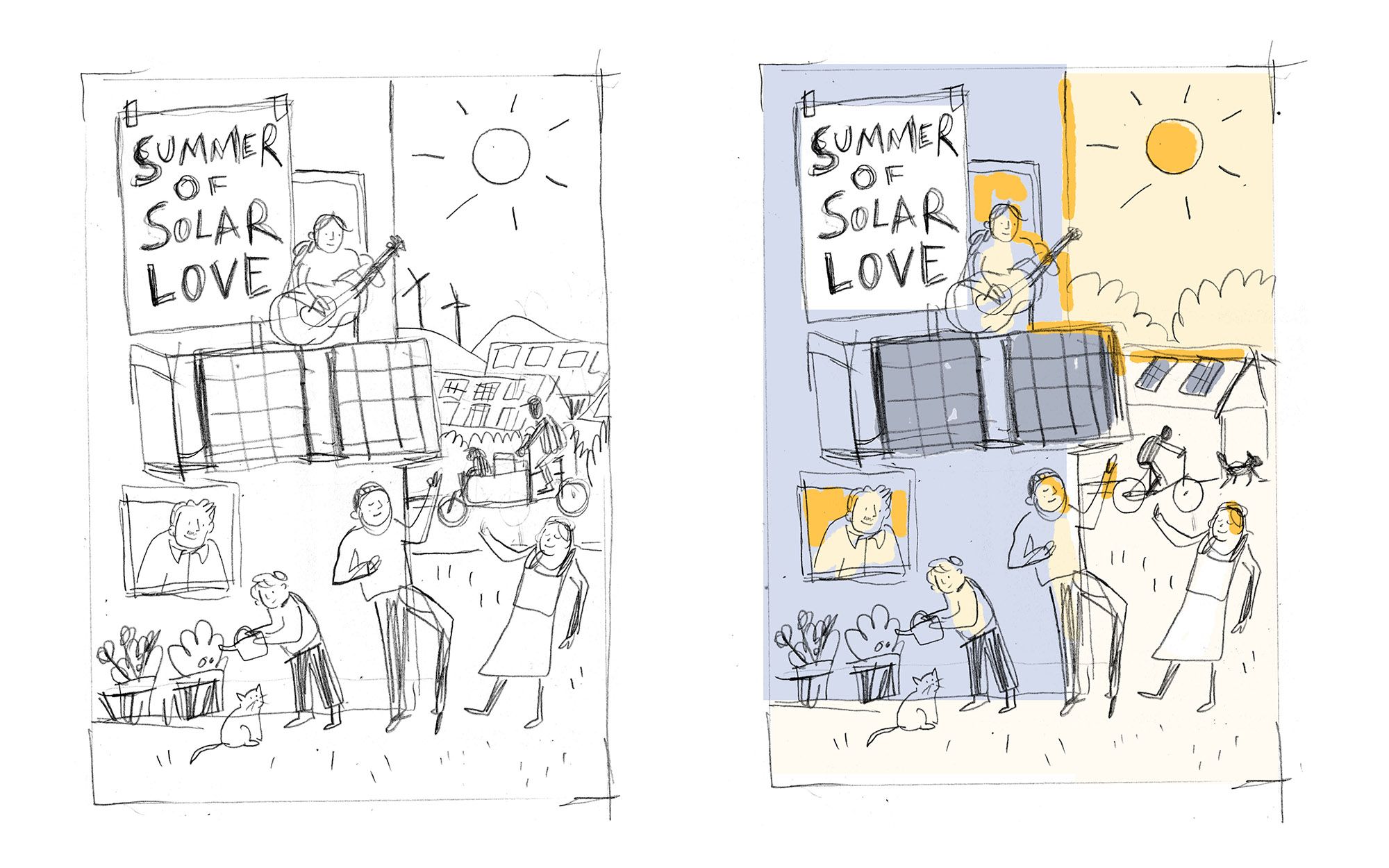
Once everything had been agreed upon, I needed to do the linework and colour it in. Usually, I create my linework on paper in ink, scan it, and colour it digitally. Due to the amount of changes that were necessary, I actually ended up drawing most of the linework digitally, as it was easier than going back to a new line drawing on paper.
I did have a lot of issues deciding on a colour scheme. As mentioned, I already knew that I wanted to contrast the sunlight with something, but the question was - with what? The orange colour scheme here doesn't have a very strong contrast, and the blue and yellow doesn't feel as warm as I want it to
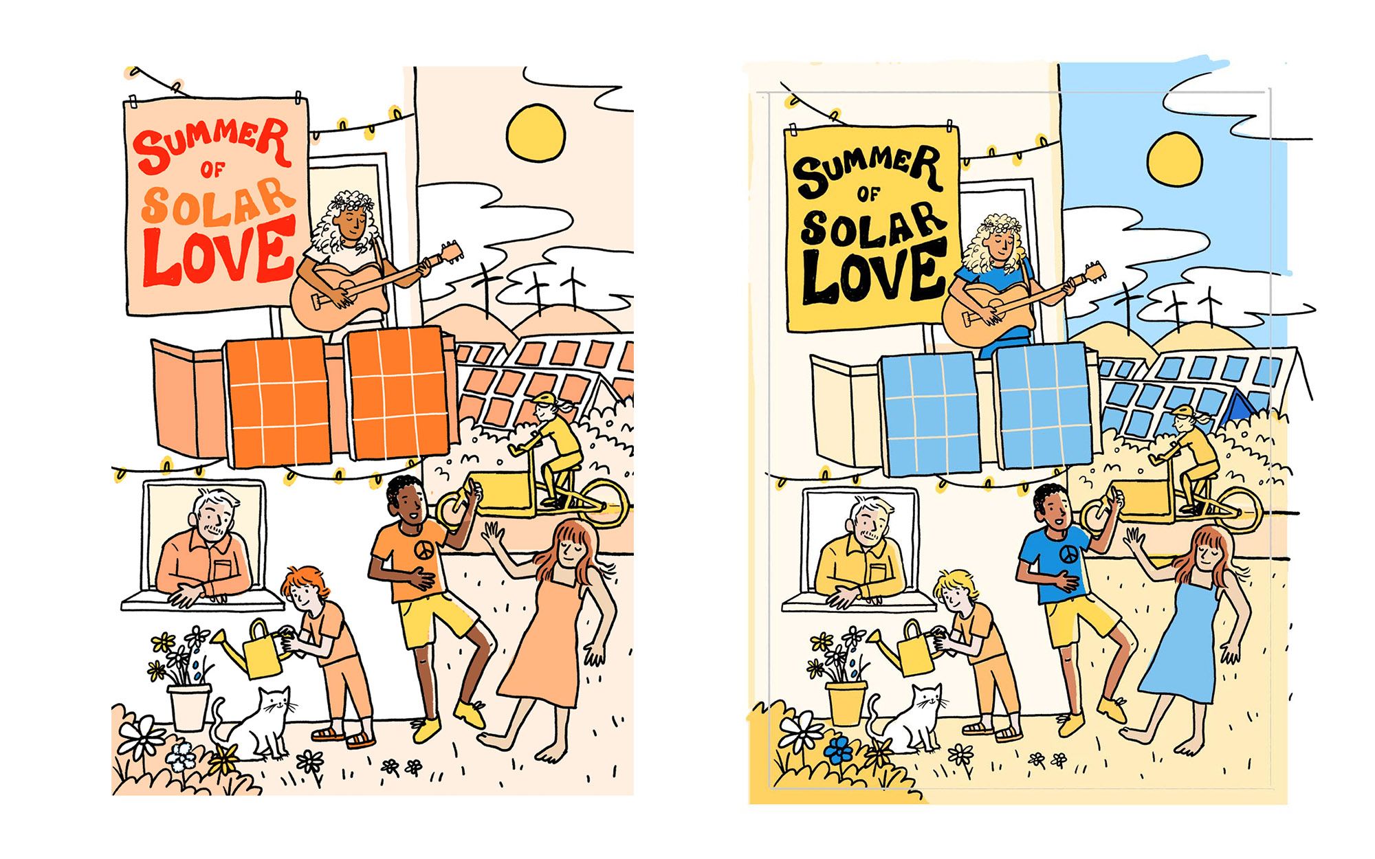
I went though many different iterations - and ultimately I arrived at this end result!
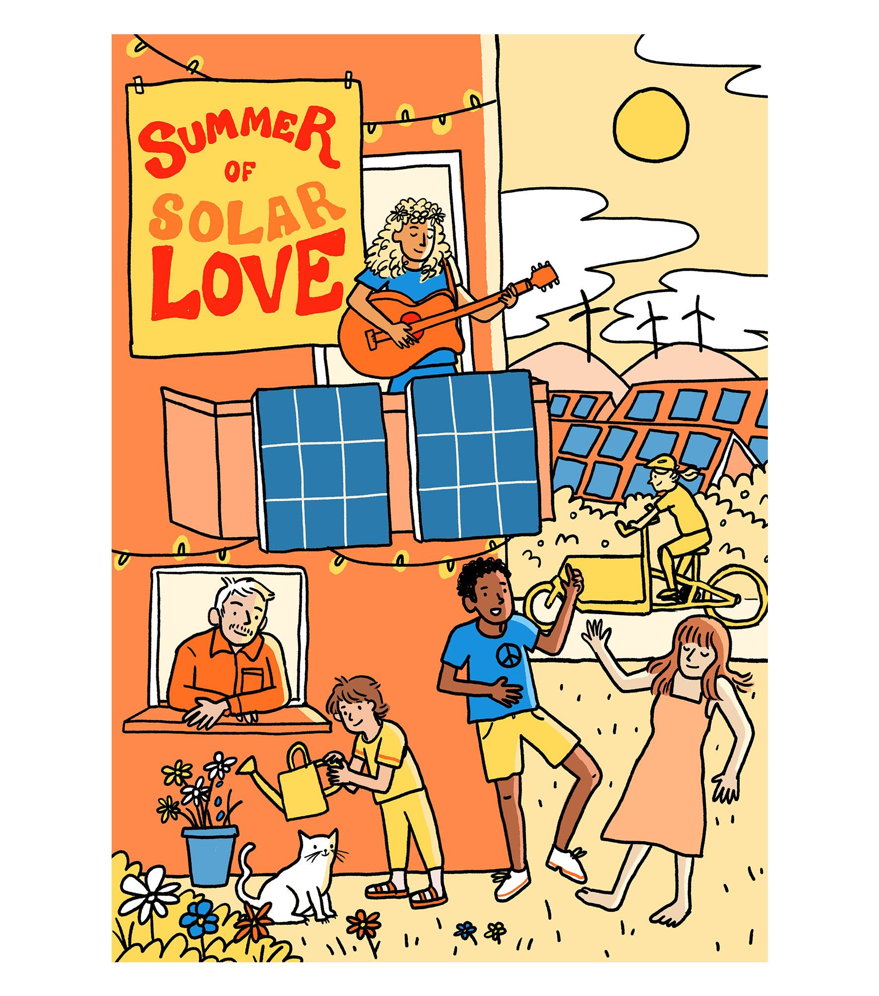
Here is the illustration on the project's website, summerofsolarlove.org
Hope you enjoyed seeing the progress of this - I rarely post all the stages of my work because I'm never sure if it's interesting for anyone to see, and because of course it takes some time to put together! As this was a commission, I actually had snapshots of all the different stages - when I work on a personal piece, I don't tend to document the process in the same way. For me, this makes me notice all the little decisions I made along the way, such as putting the stripes on the child's T-shirt sleeves.
Thanks for reading.

Comments ()