
Look up to the Skies and See...
She’s just a poor girl, she needs her ginger tea
Every morning, I make a cup of coffee for myself. I grind my coffee beans, transfer them to the AeroPress, pour hot water over the coffee grounds, and while the coffee brews - for exactly 1 minute and 30 seconds - I make Sarah’s tea. I take a bag of Twinings Spiced Ginger Tea and put it in Sarah’s Snoopy mug and add hot water from the kettle. This tea-making process is significantly easier and faster than making my coffee, and thus it feels fair that I make both of our hot drinks. As a result, I’ve developed a fondness for this routine, especially for the Twinings Spiced Ginger packaging.
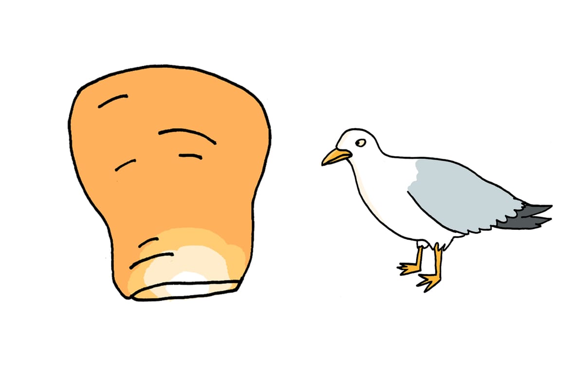
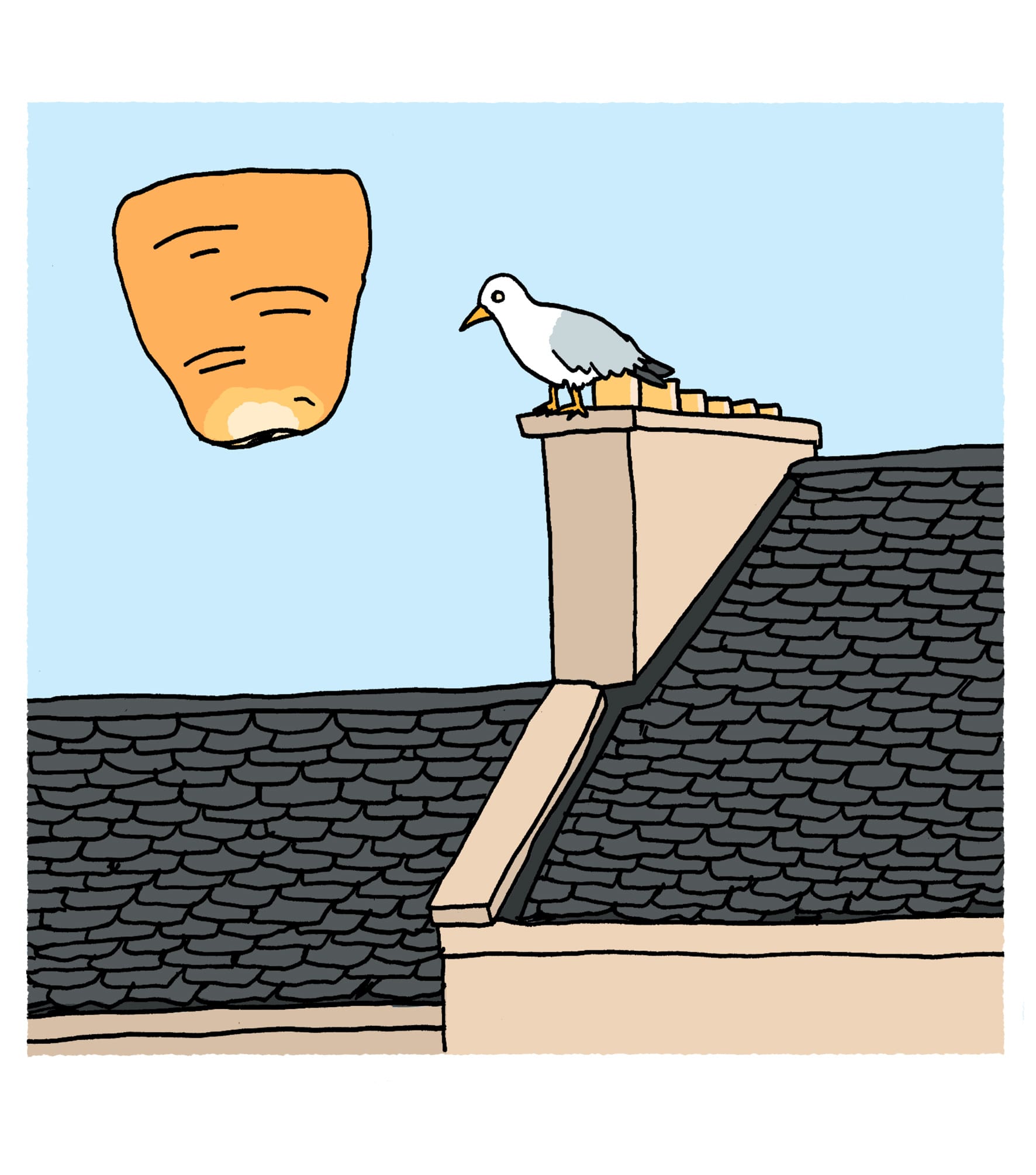
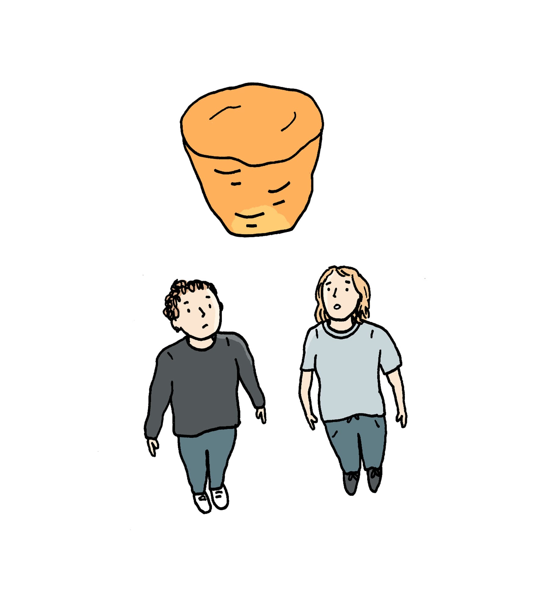
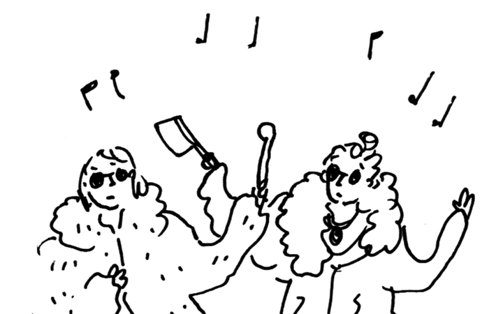
I have looked at this box most mornings over the last few years and I still find the design entertaining in its utter absurdity. The Spiced Ginger box features a man and a woman, reaching their arms towards the sky, where several giant pieces of ginger - ostensibly hollowed out and glowing like lanterns - float in the sky. The facial expressions of the people are difficult to read. Are they happy, basking in the glow of the ginger lanterns? Are they scared? This would be understandable, given that the ginger appears to be twice the size of them. And does this capture the essence of what it feels like to drink spiced ginger tea? I should ask Sarah about this; I dislike the taste of ginger tea and cannot relate to this scene.
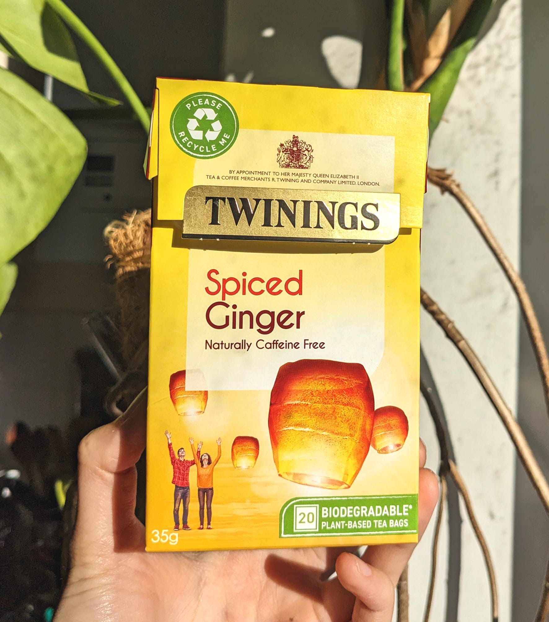
Imagine my shock, then, when Sarah arrived from the supermarket and took this out of her bag:
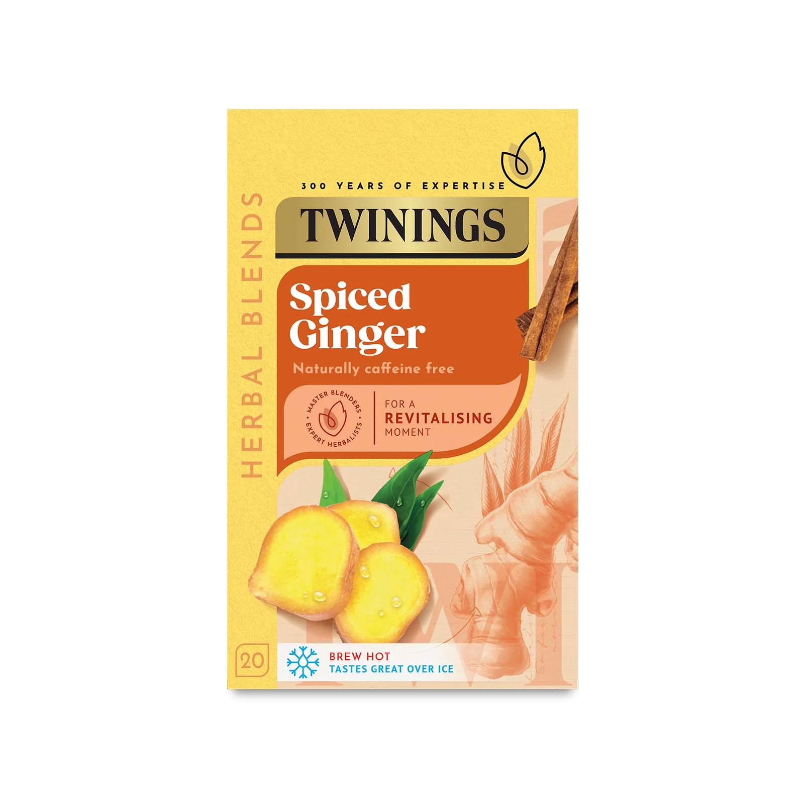
Twinings has changed the packaging - the ginger is now shown to be just ginger, not delighting people by floating through the sky.
This piqued my curiosity and, upon investigating the other flavours of Twinings tea, I discovered that this redesign has affected their full range of herbal teas. The design brief seems to have been to do away with abstract (often, may I say, unhinged) representations of the flavour to a straight-forward illustration of the ingredients. But this reduction in complexity has, in my opinion, also reduced the appeal. Take, for example, Blackcurrant & Blueberry:
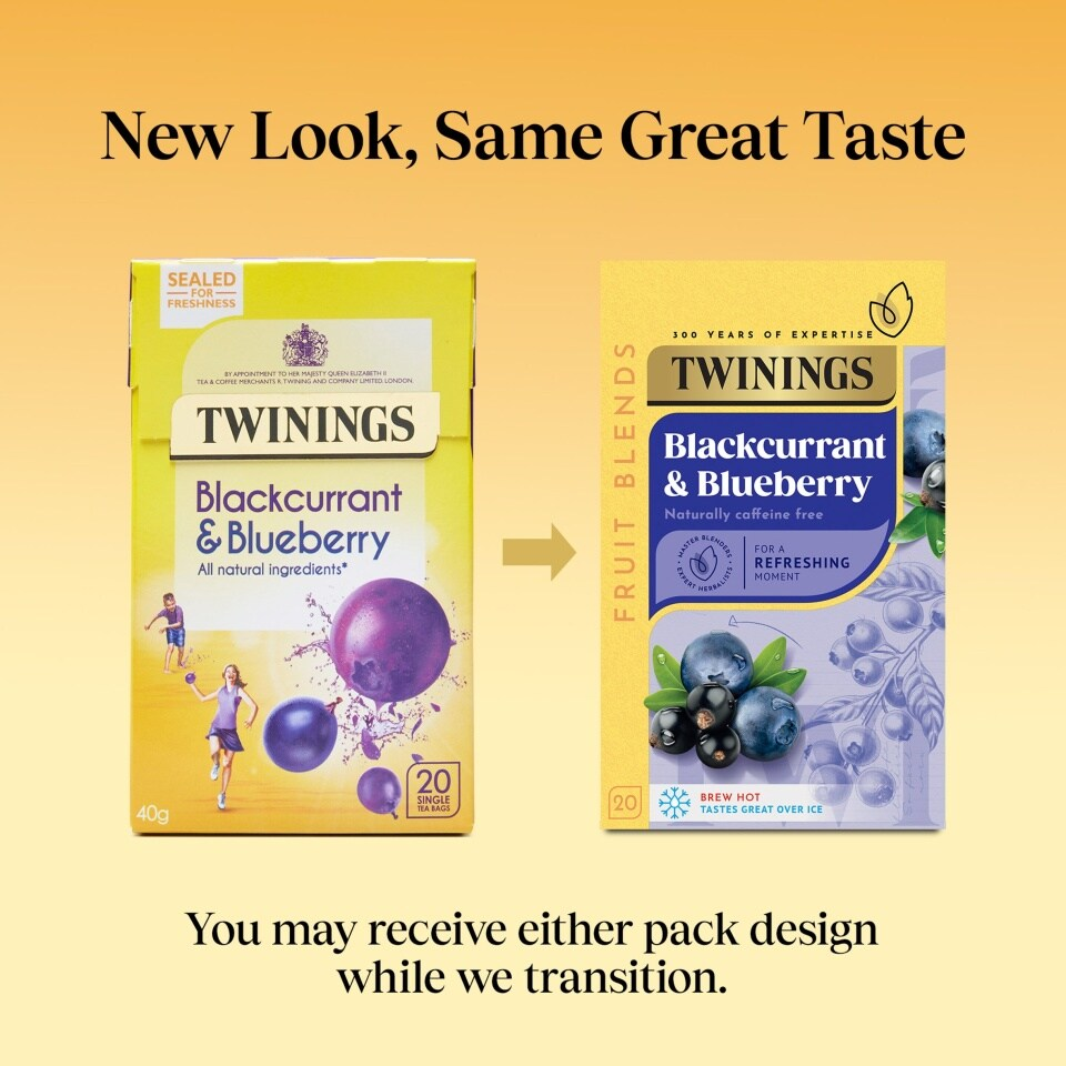
The original packaging art implies that if you drink this tea, you will feel like young people in athleisure are pelting you with berries. None of that excitement now!
Fennel featured two women running through a sprinkler that was, somehow, fennel. The promise of the feeling of water on legs, of carefree summer days didn't entice me to buy this tea, as I also strongly dislike the flavour of Fennel tea. My flavour of choice is Camomile, but I will admit that its design (a giant, flower-patterned balloon) was on the less exciting end of the spectrum. Now, however, the flavours are all equally un-exciting.
I’m sure the fine people at Twinings have their reasons for the change and did fancy research to prove that it was needed. Perhaps people complained that when they were drinking Cranberry & Raspberry, they didn’t literally receive a bouquet of giant berries that then drifted into the sky. Or that no gymnast in a red onesie served them Lemon & Ginger tea before somersaulting away.
I’m surprised by how sad it makes me that I'm facing a change to my morning routine. It’s time to say goodbye to the people on the Spiced Ginger tea box.
Thanks for reading!
L x
Comments ()